fbpx

Category: Color Tips


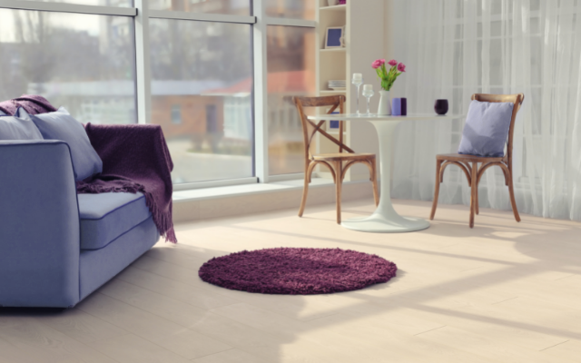
How to Use Periwinkle in Your Home

Between the blue base that we know creates more calming, serene feelings, and the addition of white to make it lighter, gentle, and tranquil, periwinkle is truly a beautiful color. Learn the psychology behind this color, why PANTONE chose it as the color of the year for 2022, and see examples of how to incorporate it into your home.

Read Full Article

Design Psychology: The Color Green

The color green brings about feelings of peace, harmony, but also excitement or even royalty. Once you familiarize yourself with this color’s great uses, we hope you’ll agree that it should be seen much more in design!

Read Full Article

Using Living Coral in Your Home’s Design – 2019 Pantone Color of the Year

PANTONE, the leaders in color, release an annual Color of the Year. It’s not just popular design styles they take into consideration, but the atmosphere of society and colors that they feel really speak to socio-economic conditions, technological influences on everyday life, and in this case, the influence social media has on relationships between people. Living Coral (PANTONE16-1546), this year’s color pick,

Read Full Article

Neutral Nurseries That Aren’t Just Green or Yellow

‘Millennial Pink Has to Go’ was the title of an article I read recently, and then Pantone announced Ultra Violet as their 2018 Color of the Year. We showed you how to use that deep purple in mature home styles, but we know those deep, dark or bold palatte just aren’t everyone’s thing. Sometimes you need a little bit of

Read Full Article

Beautiful & Grown-Up Uses for Ultra Violet in your Home

The color experts at Pantone have chosen Ultra Violet as the 2018 Color of the Year. Trends are wonderful ways to keep your smaller design elements fresh and try new things you may discover you are in love with! Here’s what Pantone had to say about their choice of this dramatic color: Creativity, imagination and inspiration are what interior design

Read Full Article

And the Winner Is…Emerald Green

As mentioned in a prior post, the 2013 Pantone Color of the Year is Emerald Green (#17-5641). Pantone is the world’s global color matching leader. Their experts select the color based on factors including economic climate, social environment, and what they see designers using on the runways. Color trends tend to hit the fashion industry first, then the home décor

Read Full Article