Use Color Like the Pros: Part 1
Color can bring a room or several rooms together for a cohesive, professional look. We are thrilled to share these great suggestions with you. They come from Fawn Chang, Director, Color Certification Program, PP&G, who brought the program to Exciting Windows.
These simple tips will help you create beautiful rooms like the pros!
Tip 1: Everything in the room counts
This included the view outside or the view of other rooms or hallways that can be seen from the room you are in. Many of us notice the collection of items in a room but we may not notice the collection of colors. Learning to see the colors and how they may or may not fit together is key to balancing and creating a harmonious space.
Notice the size, shape, location and amount of the various colors. Is the calm blue of your sofa also found in a picture hanging on the opposite wall, or maybe on a lamp shade, or an accent color in your custom draperies? Once you understand this, you’ll find it easier to design the room’s color scheme.
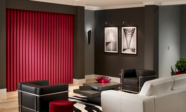
In this room, the red companion color is present in the drapes, ottoman and table decor. Otherwise, shades of white, gray and black are used throughout. A tiny amount of silver, as an accent color, is present in the chair frames and light fixtures above the wall art.
Tip 2: Golden Proportion of 60:30:10
To create a beautifully balanced room, use three main colors.
The first, the dominant color, will comprise 60-80% of the color in your room. This color sets the mood of the room (like wearing a black dress versus a red dress).
The 30% companion color will activate or calm depending upon its relationship to the dominant color –think red shoes with that black dress or taupe shoes. (We’ll share more on this in our next posting!)
The final color, the accent color, will be used 5-10%. This gives definition to the room – think pearl necklace with that black dress versus a chunky silver necklace.

This room shows one example of how to look at a space as a collection of colors. Notice there are 3 basic colors, albeit with slight variations and the colors are anchored throughout the room. The wall color is also in the rug and in the trim. 60% would be the chocolate brown, 30% would be Lion’s Mane or Honey Gold, and 10% would be in the trim, the soft Creamy White.
The color ratio doesn’t need to be an exact measure.
Fawn recommends the “squint test.” Squint your eyes while looking at the room you’re in. Squint enough to blur the edges and details while still being able to see. This will make it easier to see the room as colors and shapes rather than specific items. Be sure to include the ceiling, walls and the floor, as well as anything outside the room that you can see.
An easy approach is to remember that over half of the things in your room will be the dominant color, or variations of that color.
The companion color will make up about 1/3 of the room.
Then add the accent color to three or more items and your room will have the look and feel of the pros.
Want more?
Color Like the Pros, Part II: Creating Calm with Color
Color Like the Pros, Part III: Creating Excitement with Color
If you’d like to work one-on-one with one of our designers to help create a perfect color balance in your home, get in touch! In addition to a huge variety of window coverings, we also do custom upholstery to help you achieve a perfect color ratio with ease.