
Use Colors Like the Pros, Part III: Create Excitement with Color
We talked before about using color to create calm. This week, let’s take a look at creating excitement with color! This is the 3rd and final part in our series on “Using Color Like the Pros” based on tips from Fawn Chang, Director, Color Certification, PP&G, who brought the program to Exciting Windows.

To create excitement in a room, let’s revisit the color wheel.
Complimentary colors, colors that are opposite of each other on the wheel, create vibrancy when paired together. When you think about it, sports teams frequently use opposite colors for their team colors. The Lakers use yellow and purple. The Denver Broncos use orange and blue.
If you want to add vibrancy, use warm colors.
Red is a color of action and activity, but it can also be very powerful.
Helen Arabanos, our Design Consultant and Feng Shui Expert, warns that a lot of red in a bedroom may be too intense for sleeping. Too much red in a dining room can lead to hurried meals (think fast food restaurant) and/or digestive troubles. But in an office, it could symbolize a feeling of power and provide confidence.
When used as an accent color as opposed to the main color, red can bring great energy to a space! The red roman shades and accent pillows in the room below work well for this. They create energy, and give character to the space, without being overwhelming.

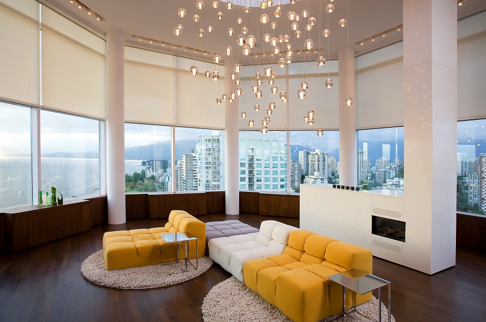
Yellow, another activating color, is referred to by Fawn as the happiest color. This photo certainly shows the truth in that statement! This bright yellow certainly brings energy to the space, whereas a paler yellow would bring a more peaceful vibe.
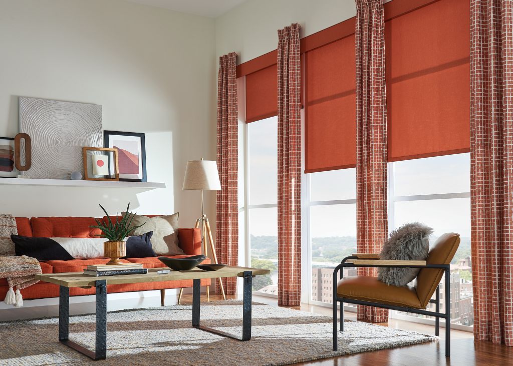
Fawn names orange as a social and energizing color; it combines the characteristics of red and yellow. This space looks amazing for socializing and family time, but it certainly wouldn’t be a restful color choice for a bedroom. That said, the type of orange you use, like any color, makes all the difference.
Check out the two rooms below. Both use orange, but the brightness of the orange makes all the difference in the energy of the spaces.

Use white as a base – carefully
According to Fawn, white activates our senses and our creativity. She cautions against using white with upholstery or carpets that may be worn/in need or replacement or needing to be cleaned. She also notes that white based colors, referred to as “clean” colors, don’t work well with muted colors. Adding to this, Helen points out that white is a color that can be cold or aloof – think hospital – so it is not good for a couple’s bedroom.
Combined with bright colors, however, white is a great base for excitement, energy, and loads of color!

That room is an example of a room with a di-chromatic color scheme, by the way. Fawn tells us the blue-grey and the warmer pink-beige offer the muted background. Excitement is added by the vibrant accents in blue and pink. Notice that the blue and fuchsia in the accents are white-based colors. Thus making them stand out while making the soft, muted tones of the furnishings and walls look more subdued.
So to summarize, when adding excitement with colors, it’s not just about the color itself but what it is combined with that really changes the feeling. Either way, don’t be afraid of adding some brighter colors to your home with window coverings, accent items or even furniture and paint!