
Use Color Like the Pros, Part II: Creating Calm with Color
Ready to relax? Let’s talk about creating calm with color!
Each room in our homes has a purpose. Bedrooms are for relaxation, for sleep, and for preparing for the day. Our kitchens are for creating delicious meals. Dining areas for eating them, and often entertaining!
Each room also should have a “feel” that matches your activities. That kitchen should be welcoming, clean, bright, and energizing. But our bedrooms should help us unwind and relax. Sometimes we use a living room for entertaining, and a family room for winding down in the evening. Our rooms that we relax in should help us do so.
Help yourself relax by ensuring the space is conducive to a calm, soothing, peaceful mood.
Let’s dig into some ways you can use color to create your relaxing spaces within your own home!
We have more great tips from Fawn Chang, Director, Color Certification, PP&G, who brought the program to Exciting Windows. (If you missed Part I, go check it out first!)
Use a Monochromatic color scheme.
We went over how to use this color scheme in kitchens for a minimalistic look too in another article!
Simply pick one color, and then use variations of it!

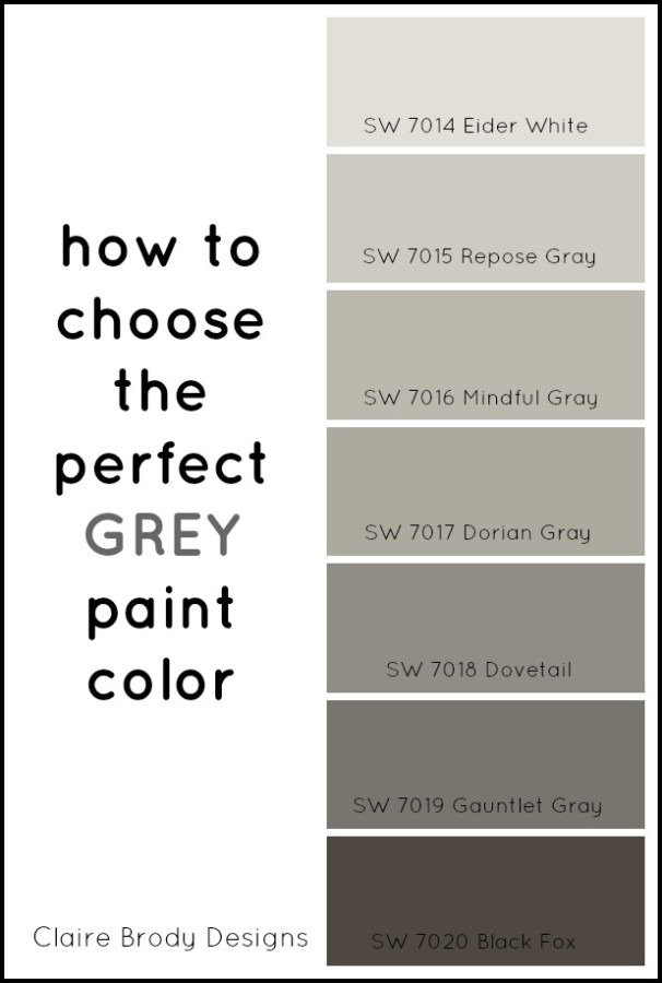
How To Choose The Perfect Grey Paint Color by Claire Brody Designs
This room uses Greyish-Beige (sometimes called “Greige”) for the walls, cellular blinds, artwork and rug. As you can see in the color samples on the right, there is a large variation of tints and shades even within one color.
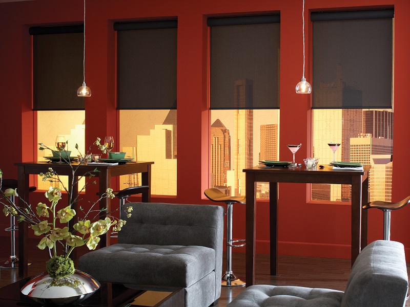
This room follows the Golden Rule mentioned in our last blog: 60:30:10. The light grey is 60% of the room’s colors, the darker grey is 30%, and the very very dark grey and black make up the last 10%. The red accent colors are added for interest and pops of color without overriding the calm, neutral feeling this room creates.
Mixing in a little warmth with cooler, calmer colors helps add balance!
Read Neutral Design Doesn’t Have to be Boring to see some of our favorite monochromatic color designs.
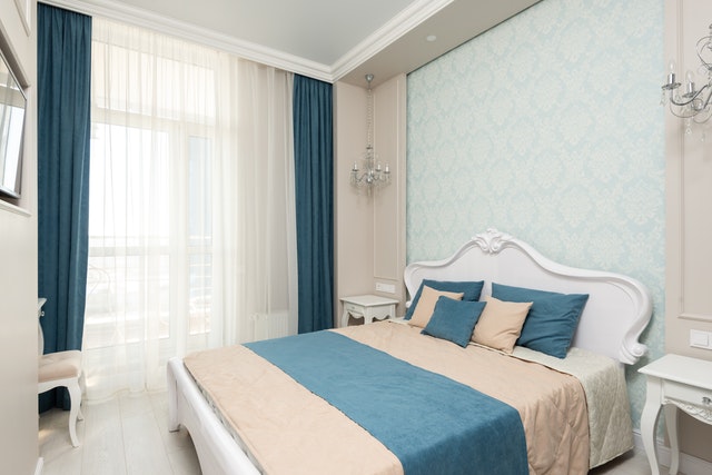
This room also uses a soft beige for the walls, wood floors, a darker version for bedding and pillows. Whites help gently offset the beige on the ceiling and furniture. Then a soft blue is used throughout. Much like the photo above with red, a secondary color with an otherwise monochromatic color scheme helps bring life to the design without being overwhelming. In this case, the dark color that stands out is used only on very soft materials. Because they draw attention visually, this helps keep the room visually “soft” and comfortable.
Choose the right calming colors
As mentioned above, more of the bright red in the first room would have made it a very different feel. In the second room, if the blue had been much brighter, it would have added some excitement as opposed to a feeling of relaxation.
The color you choose impacts the level of calm.
A monochromatic room of red will be less calm than in more peaceful colors. Red, especially brighter tones, tends to create action and excitement. Gentle blues again create a softer, more relaxing space.
This room is beautiful and modern, but not particularly designed for rest and relaxation.
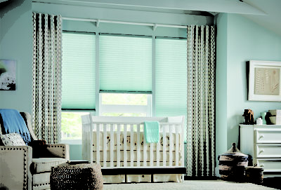
Blue is one of the best-known options for relaxing rooms and it’s pretty clear why.
Not all red is out, though. A terracotta color could be nice, calm, and peaceful!
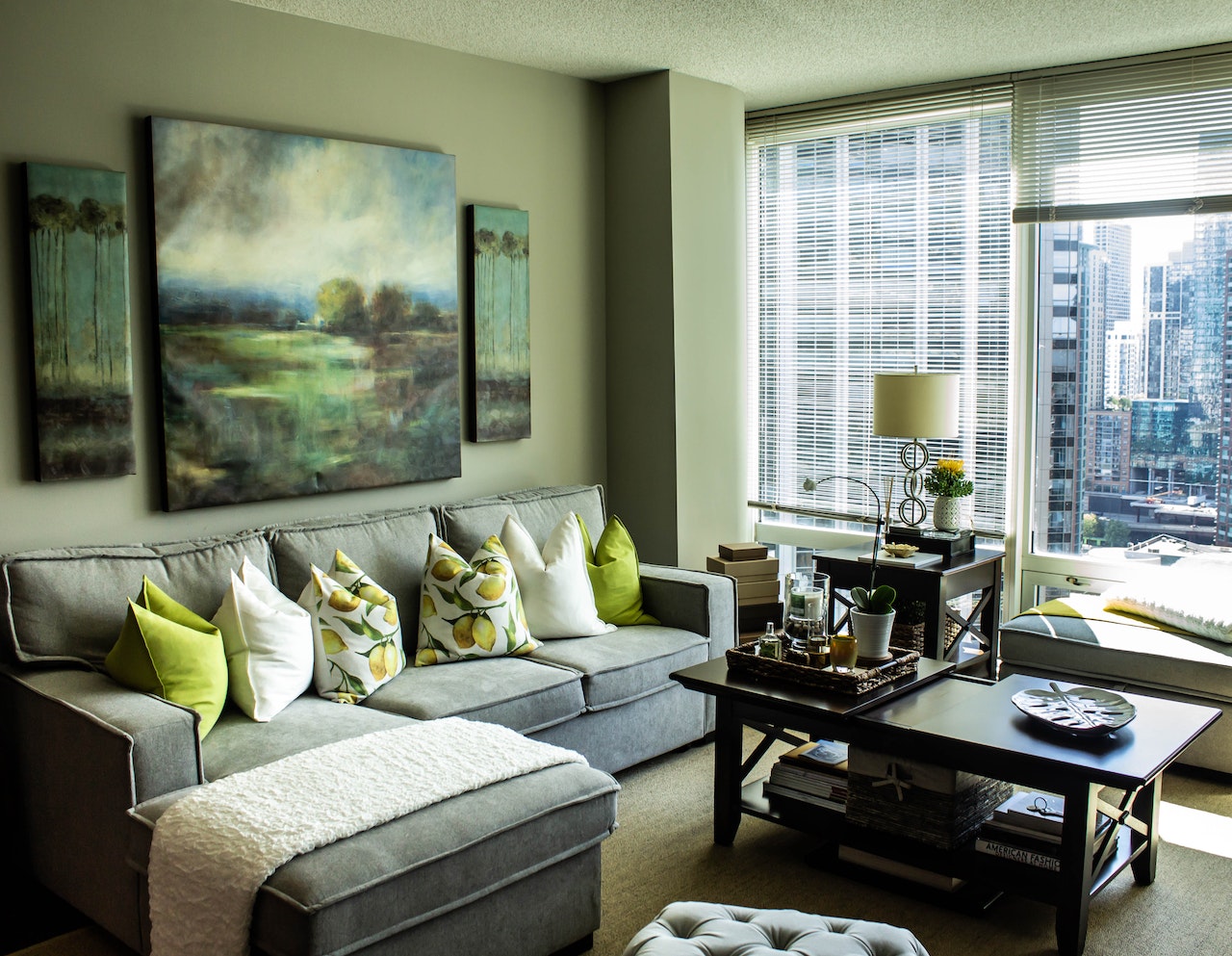
Green is another great choice with the right tone. The room below has a gentle sage main color, grey, and even some brighter yellow. But as the main textures are soft, the colors are muted, the bright colors just add a little excitement while still making the room relaxing overall. Even with lots of light!
The nature elements in the large paintings do a lot of work here to make this space calmer. Nature colors and imagery will always aid you in creating relaxing spaces.
Using the Color Wheel for Calming Combos
 Another method for creating calm is to us an analogous color scheme, or colors that are next to each other on the color wheel. You can use 2, 3 or 4 colors for your analogous color scheme, as long as they are next to each other.
For example: using violet-blue, blue, blue-green, and green would be an analogous color scheme. The above room’s greens and yellows do the same!
When choosing your color pallet, keep in mind that creating a feeling of relaxation and calm with color is easiest with cool shades. This is restful to both mind and body. Examples are blues and greens like the sky and ocean. To create a more restful, nourishing and intimate space, rich, warm beige and tans work well. These are great for a bedroom, family or kitchen – rooms where relationships and our bodies are nourished.
Ready to learn how to create excitement in a room with color?
Want to speak to one of our designers turning a space in your home into a relaxing oasis?