
How to Use Periwinkle in Your Home
PANTONE’s color of the year for 2022 is “Very Peri”, their name for an exact version of periwinkle. Their yearly color choice is always a color carefully chosen to represent the mood and emotions of the current time, through color psychology. They take into account everything from socio-economic conditions, technology, all areas of design, but also things like the entertainment industry, and even sporting events. It’s quite the process!
Color psychology is a passion of ours as well, so we hope you love seeing how you can use this year’s color in your home!

“As we move into a world of unprecedented change, the selection of PANTONE 17-3938 Very Peri brings a novel perspective and vision of the trusted and beloved blue color family, encompassing the qualities of the blues, yet at the same time with its violet undertone, Very Peri displays a spritely, joyous attitude and dynamic presence that encourages creativity and imaginative expressions.”
– Leatrice Eiseman, Executive Director of the Pantone Color Institute
The Color Psychology Behind Periwinkle
 It’s been an interesting couple of years for all of us, so a calming blue with a soft and creative purple-like look is a fantastic choice! I know for many it looks like lavender or a light purple, but periwinkle is still very solidly within the blue category. As you can see in our color wheel image, the large white circle on the left is where periwinkle falls. It has not mixed with red to create real purple. Instead, the outer circle shows the tint or shade – that is, the addition of pure white or black, respectively. Our featured color is a definite blue lightened with the addition of white, like a pastel!
In terms of color language, periwinkle is:
- HUE: blue
- TINT: added white
It’s really popular in interior design because it blends beautifully with darker blues, creams, beiges, and pure white with ease. Opposite on the color wheel is a orange and yellow, which is how some creams and beiges work so well – it’s the complimentary color!
Between the blue base that we know creates more calming, serene feelings, and the addition of white to make it lighter, gentle, and tranquil, it’s truly a beautiful color. Alongside light green and light blue, periwinkle is a very common color for dentist and doctor’s offices, as well as medical scrubs for a reason. It adds some warmth and beauty, but remains gentle and soothing, and exudes innocence. Its softness makes it a wonderful choice for rooms that you want to be calm.
It’s also, of course, the name of a flower! The flower may come in multiple colors ranging from bright pink to pure white to darker shades of true purple, but it also, of course, is an eponymously named flower that loves to be periwinkle naturally.
Using periwinkle in your home

Make it Your Secondary Color
If you know the 60-30-10 rule for interior design, you’ll know that 60% of a room is meant to be one color, 30% should be a secondary color, and 10% should be an accent. In this soft, peaceful bedroom, the accent wall is a true periwinkle. The comforter on the bed and pillows match beautifully without blending in due to the fact that they have either more white or black added, respectively. Adding white or black to a color gives you variation, but you’ll never have to worry about clashing!
The visible texture on the comforter and in the draperies also adds a little more interest to the space. The white cabinetry is smooth and sleek, so having other texture in the room helps prevent it from feeling cold, sterile, or boring.
By making it a secondary color, you get to use periwinkle without painting all walls that color. Against white and natural wood, you create a peaceful, calming space that is perfect for bedrooms.
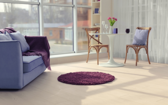
Skip the Paint Entirely
Adding a color to a space doesn’t necessarily mean adding it with paint. Instead, thing in terms of furniture and accent items! In this home, the couch, throw pillow, and a few decorative accents bring periwinkle in.
While you can’t replace a couch as easily as a throw pillow, furniture can be reupholstered if you grow tired of your theme over time (though it’s not something you’d want to do often). The magenta throw blanket and rug are a clever selection. You see, while periwinkle isn’t purple, it sure appears that way, doesn’t it? Therefore, red is right next to it on the color wheel, making it an analogous color! Analogous colors are three next to each other. So in this case, purple is in the middle of blue and red. Magenta is halfway between red and purple, and looks beautiful with our purple-ish periwinkle.
If you don’t want to invest in furniture, this gives a great example of incorporating a secondary or accent colors in a variety of ways! Think outside the box too – photo frames, chair or table legs (or both), or even the mat of your framed paintings or photos. Creatively tie your color in however you’d like in multiple places to make it look intentionally and themed.

Offset Brighter Colors
The house above is so bright and fun, yet uses periwinkle for the ceiling, couch, as well as accents throughout like the base of the coffee table and even a small tabletop accent. You can glimpse a hint of a true purple on the unique stair railings too!
With the green so bright throughout much of the design, the periwinkle contrasts beautifully but also adds a little softness to what otherwise could be an bright and energetic design. You can see a difference in the greens used – the table mat is much brighter than the pillows. The drapery panels lack as much yellow undertone as the chair. The yellow-green combination is really chartreuse, which is a brilliant choice here. While we know that periwinkle isn’t really purple, their couches move a little further towards purple than the ceiling. Yellowish-green is directly across the color wheel from the middle of blue and purple! See how easy it is to pick complementary colors?
From the pale wood floor to the white bricks and even ceiling accents, white covering such a large amount of space is what allows these creative homeowners to throw such large amounts of color into the space without it becoming overwhelming, similarly to the bedroom above with an accent wall.

We hope you’re loving periwinkle!
While this nursery follows many of the things we’ve already covered, it was just too cute not to share with you.
We hope this has given you ideas on incorporating periwinkle in your home, as well as more knowledge about how to use color!
If you’d like to learn even more, check out The Psychology of Interior Design that touches on colors and moods, a long with many other tips and tricks. If you’re interested in a deeper dive into color itself, dig into our color theory series!